
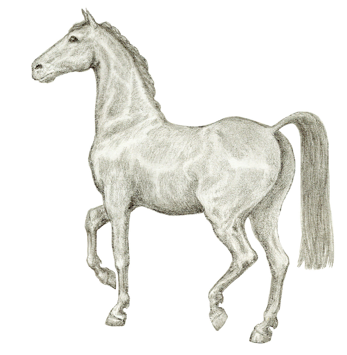
For the Red Mare Wine Company of Napa Valley, CA, I created a classical sketch of a thoroughbred mare for the logo and paired it with a clean, outlined serif font. I first drew the horse in light pencil on smooth bristol paper, then added the brick red tint in Photoshop. I was able to give the original sketch to the winemaker to frame as art, which I think is a wonderful thing you can offer with logos based on original art. On the label, I took the horse way down in size, to emphasize the name of the brand and to treat it as more of an icon, but on the business cards and other products, the horse figure plays a larger role. For this project, the logo needed to be clean, elegant, and iconic, also it needed to be versatile, so that the company could use it in a wide spectrum of applications, such as; embroidery, wood burn, projection, etc. Despite the fact that this is not a vector logo, it has been able to adapt to all the required applications, and has withstood the test of time extremely well. The logo serves to embody both the winemaker's love of horses, and the high spirited, bold flavors of the delicious, boutique Napa Valley wines she produces. To see more, go to http://www.redmarewines.com
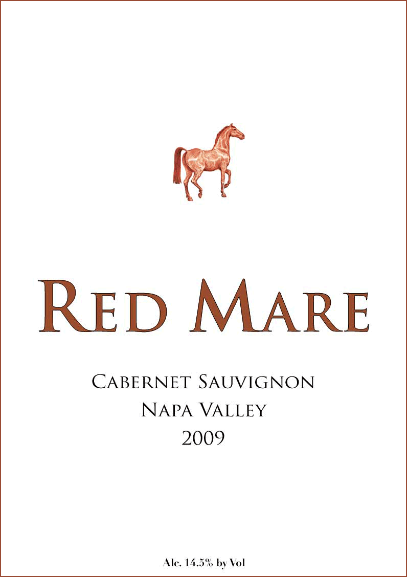
The Wine Label
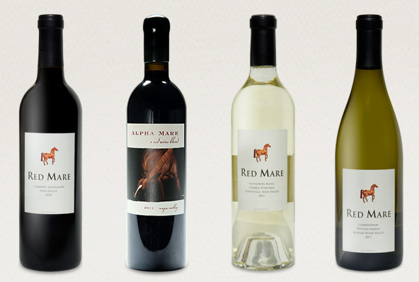
How the label looks on the bottle
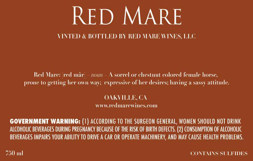
An example of the back label.

Horseshoe image created as companion artwork.